Full redesign of the Germany-Netherlands website
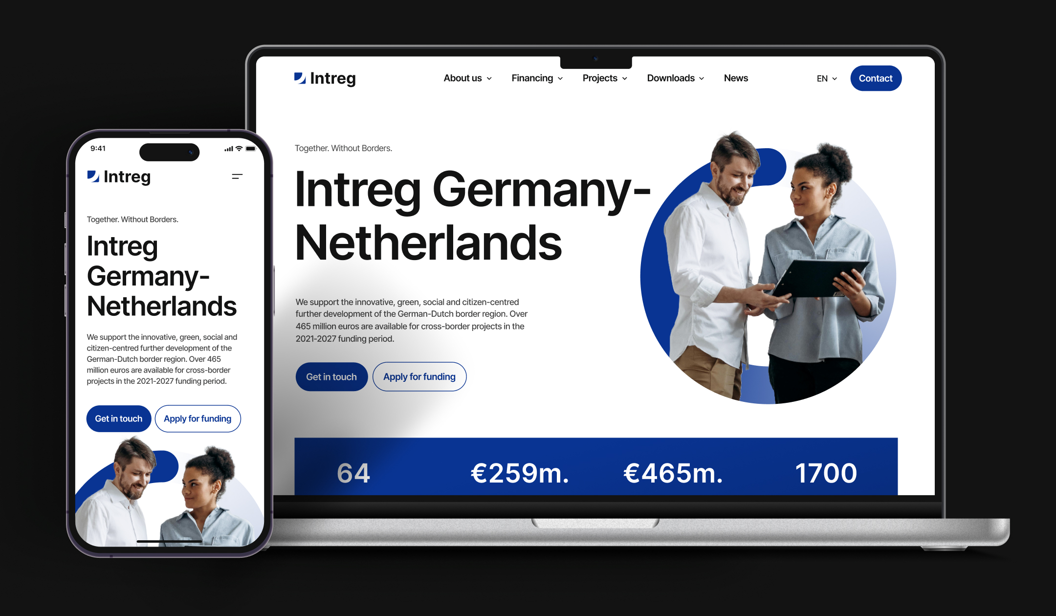
We worked with a German digital agency that won a public tender for the modernization of the existing Germany-Netherlands publiccooperation website.
Project description
The website has a big significance for the community in the region. But the key problem was that it didn’t meet the modern design standards anymore. It felt and looked old-fashioned and the navigation was not intuitively-clear. Plus for the years of existing, it stores a huge amount of posts affecting the workload time and general web site performance.
Interreg Germany-Netherlands wanted to make their website more user-friendly and more appealing to users from different age groups, including young people. That’s why it was highly important to run a redesign and technical optimization to the existing version in order not only to improve its authenticity but also to attract more visitors.
Also, it was necessary to transfer all the content from the old version to the new website and make sure that no data, files, or media would be lost. As some data is stored in external MySQL databases, our team also had a task to make it possible for the website to retrieve the required data from there.
Moreover, there was a vital requirement to move a website on WordPress as namely, this web content management system allows users to seamlessly add content to web pages on their own.
The main challenge was the fact that the project had a tough deadline of just one month and stringent budget constraints. That’s why we needed to rely on strict planning and choose the right tech stack that would ensure fast development.
This project laid a foundation for a valuable long-term cooperation with our customer, who brought us a row of other interesting projects. Thanks to our ties with this client, we got access to state projects in Germany, where the right to work on such projects is provided based on tenders.
Our approach
We reviewed the ongoing state of the website to find out what and how could be modernized. We also had a Q&A session with the client to get more details about the requirements.
When all the organizational questions were discussed, we proceeded to the design phases. It was broken into a row of iterations with clear delivery dates.
As we had only one monthmouth for the project, we built the flow needed we had to organize the design and development stages in parallel. After the structure of several pages was approved, developers started their work on them, while the designer continued working on other pages, being in direct contact with the client. It helped us to avoid interruptions in the design and development processes and not to lose valuable time.
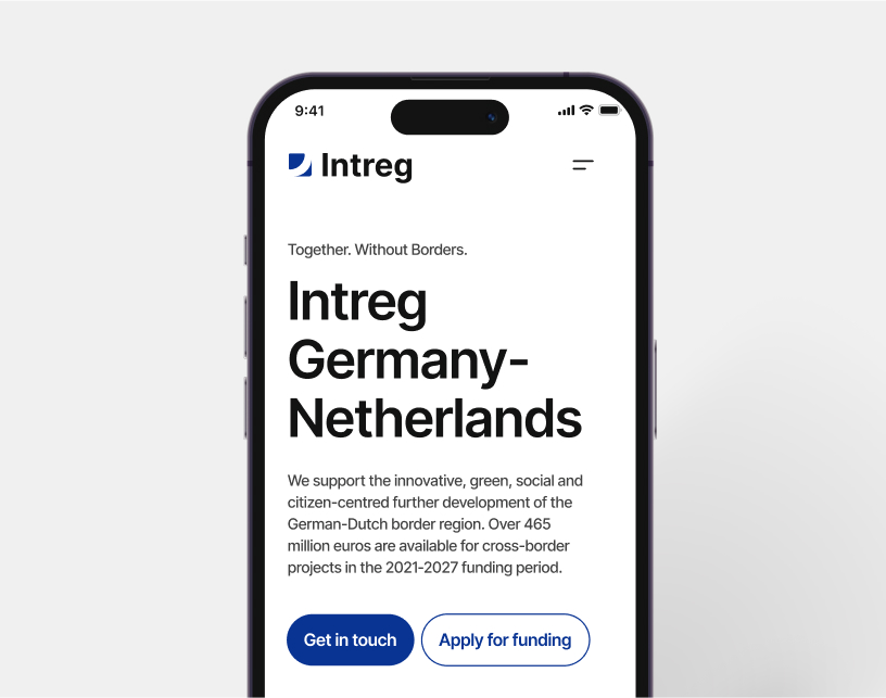
Within the project realization, we faced some issues, which required some flexibility from our side. The content on the website should be available in three languages (German, Dutch, and English). However, the end client didn’t have the possibility to provide all the Dutch content in time.
Moreover given the fact that we communicated with the Interreg Germany-Netherlands organization via our customer, sometimes the process of getting feedback took more time than usual. Nevertheless, despite such delays, we managed to finish our work in accordance with set deadlines.
The communication with the client was organized mainly via Slack. For the realization of this project, we didn’t use any task trackers as we fully relied on the set delivery dates. We also maintain the progress tracking by giving updates and loading ready parts of the project for testing and review.
Key features
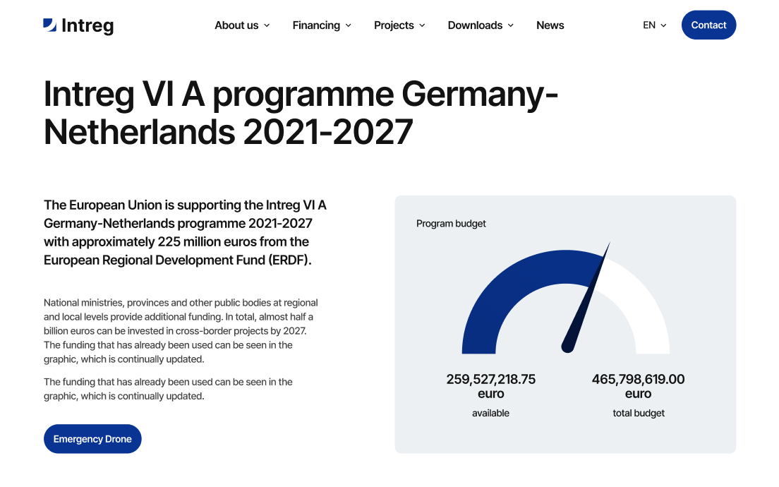
It was necessary to integrate the website with Interreg’s remote database for getting information about projects and publishing it on the website. The project info should be added to the custom tables that were created via the ACF plugin.
The project included basic SEO optimization which presupposed writing titles and meta descriptions to all the pages. We also were responsible for adding a robots.txt file and creating a sitemap in accordance with all modern standards and requirements to drive the website’s rankings.
The design of the German-Netherlands Cooperation website has to follow the existing corporate standards of the organization standing behind it. The client asked us to keep the same blocks and colors that the initial version had. To make sure that the modernized website would correspond to the requirements set for the organization’s identity, we also needed to analyze the provided brand book. The end client wanted the website to look modern and professional and at the same time, it had to be simple and intuitively clear.
Our designer, as well as the majority of our specialists, is fluent in English. This allowed us to establish smooth direct communication with the client. Some details were discussed directly in Figma, which helped to greatly facilitate and speed up the process.
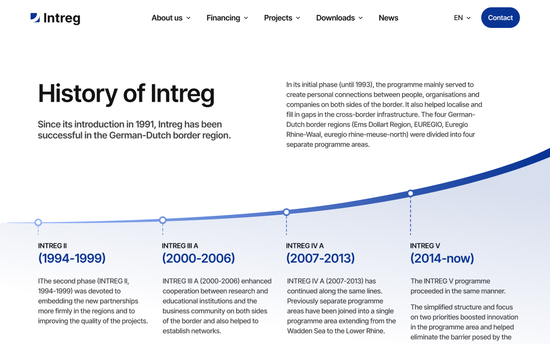
Multi-language support (German, Dutch, and English) was aimed at ensuring an equally seamless user experience for visitors from the Netherlands, Germany, and other countries. The website was very content-heavy (more than 300 articles in each of the language versions). That’s why together with the final client, it was important for us to define the scope of work that could be completed before the release. We defined 50 articles that had to be added by us and started practically a non-stop publishing process which allowed us to meet the deadlines. Working under such pressing conditions could be very stressful. Nevertheless, at UMIND, we have a well-established team. This helped us to organize our processes in the most feasible ways.
To introduce multi-language support, we relied on the WPML plugin for WordPress and combined it with the Bricks Builder.
Results
/Founder rio nord GmbH
